Tamiko Thiel:
The Connection Machine
o Main Page
o CM Legacy: Technology
o CM-1/CM-2 Design Legacy
o Articles
o Image Galleries
o "Feynman"
CM-1 T-shirt
[ Email
]
[ Portfolio
]
The Design of the Connection Machine
© 1994 Tamiko Thiel. Updated 2018 and 2024.
The original text for this article was printed as the lead article in
DesignIssues,
(Vol. 10, No. 1, Spring 1994,) an academic journal that examines design history, theory, and criticism, published by
The MIT Press, Cambridge, MA. In 2010 it was reprinted in "The Designed World: Images, Objects, Environments," Ed.: Richard Buchanan, Dennis Doordan and Victor Margolin, Berg Publishers, New York, pp. 155-166.
In 2024 I realized that I had not described my own leap beyond Feynman's description of the hypercube structure, when he said, "after the 4-D hypercube it becomes too difficult to draw". Since that leap led to my depiction of the repeating cube-of-cubes structure, which led to both the CM-1 t-shirt logo and thus to the actual physical form of the machine, I deemed it important enough to add to the text. See the description of the 4-D hypercube in Chapter II: The architecture of a new machine.
The CM-1 was replaced in 1987 by the more performant CM-2. It included floating point hardware but used the same hypercube internal structure and the same package. When I wrote the original article in 1991, the CM-2 had just been replaced by the CM-5, with a very different machine architecture and external structure.
The CM-5 was the last of the Connection Machines. In 1996, after US government funding for supercomputing was radically reduced after the end of the Cold War, many supercomputer companies including Thinking Machines Corporation filed for bankruptcy.
In 2015, when the Museum of Modern Art in New York expressed interest in acquiring a Connection Machine CM-2 for its permanent design collection, I began researching the legacy of the Connection Machine. This information is in the pages "CM Legacy: Technology" and "CM-1/CM-2 Design Legacy."
Introduction
Looking towards the 21st century, scientists have made a list of "Grand Challenges" facing us today, tasks such as the mapping of genetic structures and the modeling of global climates. Whether of a macroscopic or microscopic scale, what these problems have in common is that, until recently, they were considered too complex to analyze. The revolutionary new research tools that make it possible to investigate these problems are the parallel supercomputers -- machines with tens to thousands of multiple processors capable of performing simultaneously calculations that earlier supercomputers had to perform in sequence, one after the other.
One of the leading producers of parallel supercomputers is Thinking Machines Corporation. I was in charge of the mechanical and industrial design group that produced the package used for their first two supercomputers, the Connection Machine CM-1 and the subsequent enhanced version, the CM-2. Our desire to find a form for the machine that expressed its significance in the development of computer technology led us to re-examine the basic tenets of 20th-century design philosophy.
The basis of this philosophy for almost a century, at least for design theorists, has been "form follows function." While both ordinary consumers, as well as acclaimed designers, have staged revolts against the asceticism this dictum seems to prescribe, no one has questioned the soundness of this "rule that shall admit of no exceptions." (1) We, too, took it as the basis for our design exploration, but quickly found that the standard interpretation of this dictum -- whereby form is reduced to the utilitarian minimum necessary to fulfill structural and functional requirements -- was inadequate to our purposes. This interpretation, appropriate to artifacts of the late 19th-century Machine Age, turned out to be inapplicable to the symbolic and abstract machines of our late 20th-century Information Age.
We therefore began a search for a new paradigm for modern design, one that used form to express the functions of machines that manipulate signs and numbers, rather than physical objects. A second component of this paradigm, however, had to address the sterility that the modern movement has left in its wake. Although people have tired of the sublime ascetic purity of the early modern era, the gurus of "good taste" had instilled a permanent feeling of guilt that ornament, indeed anything that cannot be justified on strictly utilitarian grounds, is a "crime," a sign of cultural backwardness or degeneration. (2)
Steeped in the modern esthetic as we were, we could not simply paste decorations on a machine which, in the end, would have to prove its worth by raw technical performance in a fiercely competitive field. Nevertheless, we thought it important to express the emotional significance the machine had for us, and this led us away from what is considered "functional" design. Thinking that we had broken with the past, I discovered to my great surprise that we had, in fact, come full circle. We had fulfilled the original intent of "form follows function" as defined by the originator of the phrase, the American architect Louis Sullivan.
The following case study describes our search for this new paradigm and the solutions we found for the CM-1 and CM-2, solutions which have formed the basis of Thinking Machines' continuing design philosophy for all subsequent machines. Since the CM-2 was superseded in October 1991 by the next generation CM-5, this paper also serves as a valedictory for the original Connection Machine.
Chapter I: The first of a new generation
Despite our ambitious goals for the appearance of the machine, Thinking Machines' concern was based on a pragmatic need: to communicate to people that this was the first of a new generation of computers, unlike any machine they had seen before.
Today, parallel processing is acknowledged as the leading edge of computer technology. In the mid-80s, however, when the first Connection Machine was introduced, it was a very radical design. At that time, all computers employed a single main processor that performed every calculation sequentially, one step after the other. Even supercomputers used this "sequential" processing, achieving faster speeds of computation largely by pushing electronic packaging technology to the extreme limits. Rumor had it that one company even hired midgets to do the wiring, as the cables formed such a dense snarl that people of average size could not service the machine.
What was true, in any case, was that supercomputers had reached nature's ultimate barrier: the speed of light, the absolute limit on the speed of signal transmission in wires. Theoretically, parallel machines could circumvent this barrier, gaining increased speed by having multiple processors execute calculations in parallel, but they seemed impossible to program and impossible to build. As a result they were either the object of scientific research or the target of scepticism and derision.
For Danny Hillis, a student working on problems in human cognition at the Massachusetts Institute of Technology's Artificial Intelligence Laboratory in the late '70s, existing sequential supercomputers were simply inadequate for the problems that interested him. Even the fastest supercomputers were unable to recognize human faces, use language at the level of a 5-year-old child, or perform other tasks that humans, equipped with brains much slower than any supercomputer, could solve with ease. He became convinced that it was necessary to design a parallel computer with a structure closer to that of a human brain.
In order to build the first of these new machines, Hillis helped found Thinking Machines Corporation in 1983, which introduced the CM-1 in 1986 and the higher performance version, the CM-2, in 1987. (Since the CM-2 quickly replaced the CM-1, being a faster version of the same computer architecture, as well as using the same external package, I will speak only of the CM-2 from now on.) These machines had 65,536 simple 1-bit processors that could simultaneously perform the same calculation, each on its own separate data set. For problems involving the separate but interrelated actions of many similar objects or units, such as movement of atoms, fluid flow, information retrieval, or computer graphics, this "data-parallel" structure brought tremendous increases in speed while also being easy to program. Many problems that seemed impossibly complex when analyzed with sequential logic fit naturally into a parallel data structure. (3)
This type of massively parallel architecture had been tried before, but what enabled the CM-2 to succeed where other designs had failed was an extremely flexible and fast communications network between the processors. Using the model of the human brain, Hillis's design placed importance not so much on the processors themselves, but rather on the nature and mutability of the connections between them, hence the name "Connection Machine."
Due to the highly controversial nature of the machine, Thinking Machines' top management, especially Danny Hillis and Sheryl Handler, the company's president, put a high priority on a package that would not only convince viewers of the machine's uniqueness, but would also explain the nature of its architecture, so that the appearance of the machine itself would communicate its function.
Challenged by a technically difficult packaging problem and the desire to find a unique form for the machine, Thinking Machines wanted to involve an industrial designer from the outset. Knowing that my background included industrial design as well as mechanical engineering, Danny Hillis asked me to oversee both the technical and esthetic aspects of the packaging design for the CM-2. The two functions have been split apart in subsequent design projects, but Thinking Machines maintains the policy of involving industrial designers at an early stage in the development of each new machine, so that the form of the machine can be influenced by esthetic, as well as by technical, considerations.
Far from deriding the esthetic aspects as unimportant, Dick Clayton, head of engineering at Thinking Machines, and Ted Bilodeau, the consulting mechanical engineer for the CM-2, fully supported the effort to produce a unique package for the machine and made it possible to implement an unusual design. Confronted with problems, they always found solutions instead of raising objections, and considerably enriched the design through their participation.
Chapter II: The architecture of a new machine
The search for a form had to start with bare practicalities: how do you physically organize a machine with 65,536 processors? Is it physically possible to build it like a "normal" machine, or would we have to wallpaper a room with boards, and weave a rat's nest of cables between them?
The processors were grouped 16 to a chip, making a total of 4,096 chips. These chips were to be wired together in a network having the shape of a 12-dimensional hypercube. The term "12-D," far from having to do with warp drives and extraterrestrials, had the mundane but complicated meaning that each computer chip would be directly wired to 12 other chips in such a way that any two chips - - and thereby the 16 processors contained in each chip -- could communicate with each other in 12 or less steps. This network would enable the rapid and flexible communication between processors that made the CM-2 so effective. (4)
Overwhelmed by the effort to visualize a 12-D connection scheme for 4,096 chips, I expressed my bemusement to Richard Feynman, the Nobel Prize-winning physicist who was helping us design the network. (His son Carl was working on the Connection Machine, and the project sounded so interesting that Richard asked if he could help too!) Feynman had the rare talent of being able to explain the most complicated things simply, and characteristically his reply to my complaint was, "Oh, that's easy!"
Feynman drew two chips and connected them to make a "1-D" cube. This is what we commonly call a "line." He then joined two 1-D cubes at their ends to make a "2-D" cube, what we commonly call a "square." Next he joined two 2-D cubes to make a "3-D" cube, which is the same as our usual understanding of a "cube:"
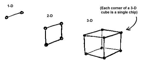
First 3 dimensions of a hypercube
Then came the
difficult step into the 4th dimension: he drew one 3-D
cubes inside the other and connected their ends, joining like corners to make a "4-D" cube. This is the
first stage of what is called a hypercube, a cube with more than 3 dimensions. "After that," he said, "it becomes too difficult to draw!"
I however had to go beyond the 4-D cube and produce a complete and clearly understandable wiring diagram for all 12 dimensions. I played around with the form on paper and pencil (we did not have 3D computer graphics yet!) and finally realized that if I pull the inner cube out and place it to the side of the outer cube, maintaining all the corner-to-corner connections as if they were rubber bands, I had a representation of a 4-D cube that looked just like a 1-D cube. I then applied a radical graphic simplification: I represented all dimensions greater than 3 as thick "hyperlines," in order to visually simplify the resultant structures:
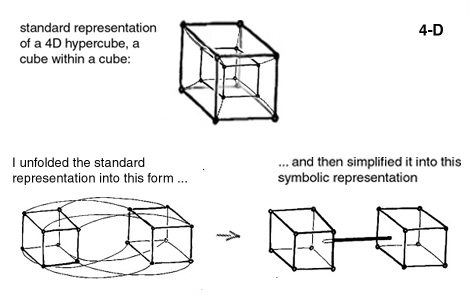
4th dimension of a hypercube
This symbolic representation has the added benefit of showing
in a glance that the structures
always repeat themselves: a 4-D hypercube looks just like a 1-D
line, except that it connects two cubes rather than two chips. A 5-
D hypercube is a square of cubes:
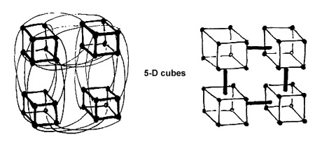
5th dimension of a hypercube
...and a 6-D hypercube is a cube of
cubes:
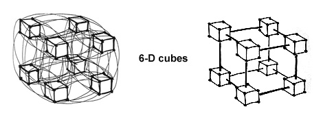
6th dimension of a hypercube
Going further, a 9-D hypercube is a cube of 6-D hypercubes:
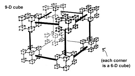
9th dimension of a hypercube
...and a 12-D hypercube is a cube of 9-D hypercubes:
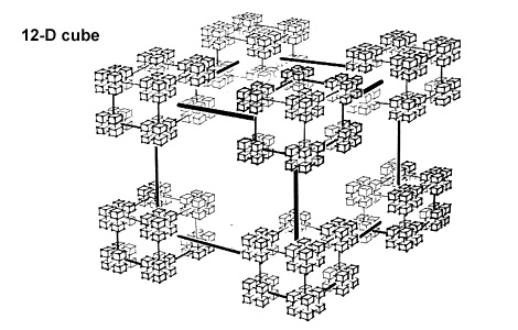
12th dimension of a hypercube
This is the structure used in the CM-2, a cube with 2 to the power 12 corners, or 4,096 chips, each connected to 12 other chips, each connection being one dimension of the cube.
This structure was repeated throughout every level of the machine, in the traces connecting processor chips, in the connectors between the printed circuit boards, and in the 1,000 feet of cable connecting the highest dimensions of the machine. Once we understood this basic organizational principle, we could start to build the machine. Ted Bilodeau, working on the mechanical side, and Dick Clayton, working on the electrical side, were able to reduce the machine's original proportions from room-sized to machine-sized, using only standard, off-the-shelf computer packaging technology.
Chapter III: The search for a design paradigm
Now we could turn our attention to the esthetic aspects of the Connection Machine: how did we view it, what did it mean to us, what did we want to say about it? We wanted a strong, simple form that had meaning, that expressed the essence of the machine -- we wanted to let the machine speak for itself.
Our goal seemed to be clear: we wanted to show how the machine worked. The most obvious solution seemed to be to expose the interior of the computer, baring the boards and cables that made up the machine. But every computer had boards and cables -- how could we show that this machine was quite different?
Just at this time Sidney Lawrence published an article called "Clean Machines at the Modern" in the magazine Art in America. Lawrence's article described the evolution of the idea of functionalism, showing how the Museum of Modern Art in New York had elevated the Bauhaus emphasis on "material and proportion rather than applied ornament" (5) to serve as the exclusive canon of good design and good taste. In MoMA's dictum I recognized the source of our own ideas on design: "it was precisely the inner workings of mechanical objects that offered an appropriate standard and inspiration for contemporary design.... Functional design should expose and clarify function, not disguise it." (6)
Modern architects used this paradigm to lay bare the basic components of building: space, load-bearing members and building materials. Product designers dealing with exclusively mechanical products, where the physical form largely determines the function, could also implement this principle with ease. A mechanical device expresses its function in the visible world, it is graspable, and moves or physically affects its operators and their world. We, however, were working with a very different sort of product.
Our dilemma was succinctly described in the same article: "[electronic machines] are incomprehensible unless one knows about the existence of invisible forces ... [they] do not visually explain themselves." (7) Indeed, both a simple text processor and a powerful supercomputer are composed of exactly the same elements -- chips, printed circuit boards, and cables -- and everyone except an electronics specialist will see a difference in quantity, but not quality, between these two extremes. As Lawrence concluded, "The jumbled appearances of a computer circuit, in fact, tell us nothing at all about its function." (8)
The MoMA design department has addressed itself to the esthetics of electronic components and has even exhibited the schematic beauty of integrated circuits and printed circuit boards. This fascination with the internal components of electronic devices gives no help, however, to the designer confronted with the task of developing the external appearance of a machine. Still, MoMA's design department gave us an important starting point with its characterization of the esthetics of electronics as "the dematerialization of finite shapes into diagrammatic relationships." (9)
It became clear to me that we had to extend the meaning of "function" beyond physical structure, beyond the purely mechanical into the abstract. Indeed, for people who work with computers, the image of the machine in their minds has nothing to do with boards and cables. Instead, they see the conceptual structure of the system, the "diagrammatic relationships" which can vary in function and detail in the same way that human habitation can vary from a rough, simple shelter to an ornate and complex palace. To truly understand the function of a computer one has to look at the schematic representations computer scientists use to talk about the architecture of a computer, the structure buried in microsopic layers of silicon and hidden in mazes of electronic circuitry.
This extension of the definition of "function" was our first departure from the tenet that mechanical machines should provide "a standard of reference for judging contemporary design." (10) The second departure was a rejection of the sterile, cold utilitarianism that the term "functionalism" has come to represent. We didn't want to build a computer that looked just like a refrigerator or a washing machine, even if that was the most "practical" and "functional" way to package it. We wanted the design to express the excitement we felt about the machine and about its potential to revolutionize computer architecture.
For many people, computers are bloodless beige boxes with incomprehensible electronic displays that never work anyway, especially when one is in a hurry. Scientists involved in computer research, on the other hand, see computers as the tools for building new worlds; they see themselves as pioneers and settlers in a wilderness conquered not by the plow and the rifle, nor by space ships and laser guns, but by mathematics and programs, by the brain and by abstract thought. In this community people often refer to acquaintances by their electronic mail addresses, and many friendships -- and even marriages -- have started on the world-wide communication network that instantly connects research labs in different cities into one great electronic watering hole.
We at Thinking Machines were all members of this electronic tribe. For us the "electronic village" eagerly awaited by preachers and gurus of the Information Age has long been a reality of daily life. The activities of this "daily life" are a semiotician's dream -- or nightmare: the members of these tribes spend their time creating signs with no physical referents, systems of signs that mean exactly what their inventors wish them to mean, and worlds that function according to rules made up by their creators.
Artists and natural scientists also create intricate systems of signs or symbols, building worlds of their own that an outsider must study in order to understand. Why do lay people consider artists and natural scientists interesting, if slightly weird, while they view computer scientists as simply wierd? The purpose of both art and science is to develop and communicate insights into the physical and spiritual world we all share. The systems of signs that computer scientists build, however, are actually schematic descriptions of the insides of machines and, as such, are self- referential rather than interpretive or representational. The double-helix model of the structure of a human gene, for instance, describes something that is part of each of us, but a diagram of the message-passing network of a computer describes something that is part of a machine in which only a specialist has an interest. In the design of the Connection Machine, we wanted to express the mystery of the world of computers in a way that would capture the imagination of all who saw it.
Chapter IV. The machine takes form
The inspiration for the design, I believed, should come from the ideas of the computer scientists who were developing the CM-2. Danny Hillis, but also Brewster Kahle and Carl Feynman, with whom I shared an office, were all filled with a passionate and infectious enthusiasm for the machine. They talked of the machine as a cerebral starship, a vehicle that could open up boundless new frontiers, or as an immensely complex, constantly fluctuating electronic society -- the image of an electronic brain.
Their visions of the machine evoked in my mind the sculptures of the Italian artist Arnaldo Pomodoro. His simple, smoothly polished geometric forms cut into or eroded away by deep surface incisions have always suggested strange planets or massive starships to me. Beneath the smooth and the serrated surfaces of his sculptures there seemed to be room for entire worlds, high-technology cultures, long-dead civilizations. His work communicated a sense of immense, seething complexity beneath the surface of a geometric, man-made object.
These were the feelings and images I wanted to capture in the physical form of the CM-2. Aware of the incestuous nature of our relationship to the Connection Machine, we looked for help from impartial, experienced outside viewers as well. The industrial designers Allen Hawthorne and Gordon Bruce, who had had many years of experience designing computer products for IBM, agreed to help us with the detailed design of the machine. Additionally, to make sure we hadn't blinded ourselves to any possibilities, I asked the architect Tom Chytrowsky to spend some time helping me experiment with pure form, brainstorming whatever possible and impossible shapes the machine could take.
But if form should follow function, and function in a computer means the workings of the invisible processors hidden in the silicon chips, then the real function of the CM-2 lay in the way the processors communicated with each other, in the structure of the 12-D hypercube network. Hawthorne and Bruce were themselves convinced from the beginning that the cube-of-cubes was the right shape for the machine: the large cube built up out of 8 smaller cubes, which I had developed as a visual symbol of the original CM-1 for internal use at Thinking Machines.
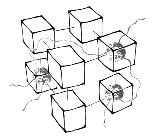
CM-1 t-shirt logo
This symbol had been widely published on the Thinking Machines T- shirt worn by Richard Feynman on the original cover of his popular book "What Do You Care What Other People Think?" and then made famous when as the "Feynman t-shirt" in the 1990s, when Apple's "Think different" campaign used a photo of him wearing the CM-1 t-shirt.
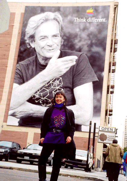
"Feynman" CM-1 t-shirt design
The graphic of a 3-D hypercube represents the "hard" electrical connections of part of the 12-D network, but inside these hard rectangular boxes are the "fuzzy" software connections that can be changed independently of the physical wires and traces.
The hard physical wiring and the soft programmable connections were equally important aspects of the structure of the machine. How could we make something as abstract as a program -- with the intangibility of a speech or a conversation -- visible to the eye? Carl Feynman had described a fantasy of the CM-2 as a vast cloud of lights that flickered as they sent their electronic messages back and forth, like the firing of neurons in a brain. Status lights are commonly installed on printed circuit boards to provide visual monitors of the current state of components -- indicating whether power is "on," or a chip is plugged in properly. Why not use these to make the intangible and unseen activity of the processors visible on the outside of the machine?
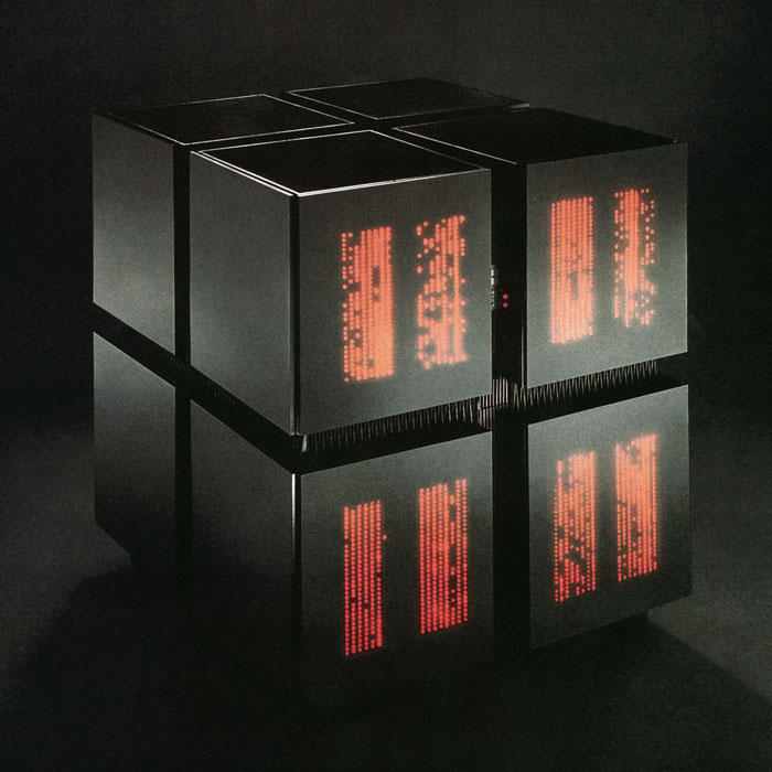
Thus, we chose to depict the hardware structure of the machine in the external form of the CM-2 package, and depicted the software connections within this hardware structure using the status lights of the chips: eight cubes, each holding 9 dimensions of the hypercube, are visually plugged together to form the cube-of-cubes, just as the internal electronic components are physically plugged together to form the highest level of the machine, the 12-D hypercube. Through the skin of the machine glow the lights from 4,096 chips, flickering on and off as the processors work in parallel, each one computing its own part of the data. The microscopic elements of the machine, as well as those buried in the confusion of traces and cables, thus become visible and let the machine speak for itself.
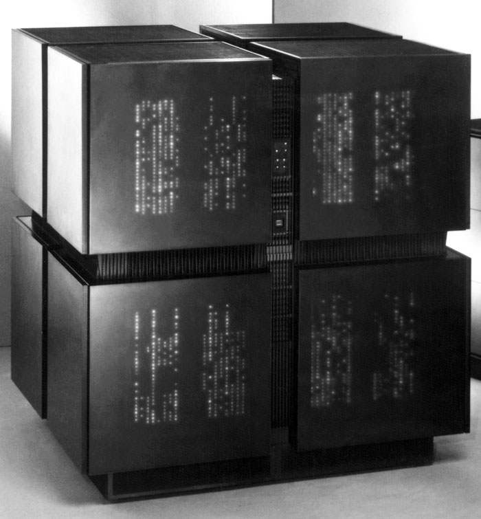
This would communicate to the viewer the immense complexity hidden beneath the surface of the machine. A massive electronic brain, 1.5 meters in height, it is connected with cables to the data drives that feed its processors information and to the workstations and monitors through which it communicates with its human users. A hard, geometric object, black (the non-color of sheer, static mass), it is filled with a soft, constantly changing cloud of lights, red (the color of life and energy). This would be a way to ornament without decorating, to express a symbolic aspect of the machine using raw form, size and proportion, color and material.
Chapter V.: A return to the future
We had gone beyond the utilitarianism and sterility that "form follows function" seemed to require, defying the stricture that only structure is "good," and all else "evil." We wanted to go beyond the "necessary" to stress our vision of the CM-2 -- the emotional meaning of this machine to us and our relationship to it. We saw it as a break from the past and from the strictures of the modern, but while researching this article I came to the realization that we had, on the contrary, come full circle.
Informal questioning of my architect and designer friends showed that most attributed the injunction "form follows function" to Louis Kahn or Mies van der Rohe, assigning the pronouncement to someone whose works fit our current idea of its meaning. In fact, its originator was Louis Sullivan, for whom it was the culmination of a lifelong search for a rule that "shall be so broad as to admit of no exception." (11) This came to me as quite a shock: Sullivan, a radical architect at the end of the 19th century, was celebrated for the power and invention of his ornament. He himself once said that "while the mass-composition [in an ornamented structure] is the more profound, the decorative ornamentation is the more intense." (12)
In Carl Condit's book The Chicago School of Architecture, I read: "The proper understanding of the word 'function' is the key to [Sullivan's] whole philosophy.... These factors embrace not only the technical and utilitarian problems of building but also the aspirations, values, ideals and spiritual needs of human beings. Thus functionalism involved for him something far wider and deeper than utilitarian and structural considerations, as important as these are." In seeking to break away from the constraints of "form follows function," we had in fact come back to the broader intent that informed Sullivan's use of the celebrated phrase. (13)
Sullivan did seem to have set the course for the modern movement when he suggested in 1892 that "it would be greatly for our esthetic good if we should refrain entirely from the use of ornament for a period of years, in order that our thought might concentrate acutely upon the production of buildings well formed and comely in the nude." (14) This genteel formulation appeared in a much more vehement form in the writings of Adolf Loos some 15 years later. His essay "Ornament and Crime" inveighed not only against the taste for the overly ornamented, but also against efforts to adapt ornament to fit the times, as in Art Nouveau and the products of the Wiener Werkbund.
"Since ornament is no longer a natural product of our culture, but only a sign of backwardness or degeneration, the work of the ornamenter is no longer adequately compensated," he declared. Linking esthetic standards and social goals, he advocated the radical elimination of all ornament as the only morally permissible consequence. His was one of the most compelling voices calling for products to be manufactured to fulfill the demands of quality and durability rather than to satisfy the whim of fashion. (15)
In a world of ever-shrinking resources and ever-mounting pollution and waste, Loos's goal has, if anything, gained validity. I believe, however, that his identification of the source of this evil was wrong. Despite his respect for native cultures, Loos saw "modern man" as being at a higher level of moral evolution than "primitive man." (16) Now, in an age that admires the aboriginal populations of the world as models of how to live in a forgotten harmony with the earth, we may also reject Loos's declaration that "Perceiving decoration as a merit means taking the standpoint of an Indian. We must overcome the Indian in us." (17) Perhaps we need to do exactly the opposite, and look at the so-called primitive or pre-industrial cultures to find out how they use ornament to increase the significance and worth of the objects they produce.
We in the industrial and postindustrial cultures have lost the tradition of ornament as an important carrier of symbolic meaning, and the "postmodernist" style of borrowing ornament from previous eras will not satisfy this need, because the symbols of the past bear no relation to the dreams, hopes, and fears that we harbor today. We cannot borrow from other cultures and other eras, we are confronted with a much harder task: we must relearn how to invest designed objects with a symbolic significance that can speak to the experience of living at the beginning of the third millennium. After years of just such an experiment as Sullivan had proposed, we must relearn the significance that ornament used to have, and what sort of human needs it used to fill.
We did not approach the CM-2 design with the idea that we must "ornament"; rather, we wanted to use the appearance of the machine as an expressive possibility to show how the machine worked. We had taken Sullivan's "form follows function", and nearly a century later adapted it to machines that he could not have dreamed of in his lifetime, machines that revolutionized the meaning of the word "machine" itself, with functions that are invisible, intangible, and abstract. We found that in a machine where structure can only be expressed through signs and diagrams, symbolism becomes a necessary tool to explicate function.
Sullivan, to whom symbolism and emotion were important aspects of a design, did not mean that designers should shy away from the emotional content of their designs. On the contrary, he celebrated human creativity as "the enormous power of man to build as a mirage, the fabric of his dreams, and with his wand of toil to make them real." To us, building the Connection Machines CM-1 and CM-2, nearly a century after these words were written, no description of our efforts could ring more true. (18)
Footnotes:
- Condit, Carl W., The Chicago School of Architecture, University
of Chicago Press, 1964, p. 35
- Loos, Adolf, "Ornament und Verbrechen," from 1908, Saemtliche
Schriften, ed. Franz Glueck, Verlag Herold, Wien, 1962, pp. 277
- Hillis, W. Daniel, "The Connection Machine," Scientific
American, June 1987, vol. 256, pp. 108
- Hillis, W. Daniel, "The Connection Machine," Scientific American, June 1987, vol. 256, p. 111
- As quoted in Lawrence, Sidney, "Clean Machines at the Modern," Art in America, Feb. 1984, pp. 132
- Lawrence, Sidney, "Clean Machines at the Modern," Art in America, Feb. 1984, p. 135
- As quoted in Lawrence, Sidney, "Clean Machines at the Modern," Art in America, Feb. 1984, pp. 138 - 139
- Lawrence, Sidney, "Clean Machines at the Modern," Art in America, Feb. 1984, pp. 166 - 67
- As quoted in Lawrence, Sidney, "Clean Machines at the Modern," Art in America, Feb. 1984, p. 139
- As quoted in Lawrence, Sidney, "Clean Machines at the Modern," Art in America, Feb. 1984, p. 167
- Sullivan, Louis, The Autobiography of an Idea, Dover
Publications, Inc., New York, 1956, p. 221
- Sullivan, Louis, "Ornament in Architecture," Kindergarten
Chats, Dover Publications, Inc., New York, 1979, p. 188
- Condit, Carl W., The Chicago School of Architecture, University
of Chicago Press, 1964, p. 37
- Sullivan, Louis, "Ornament in Architecture," Kindergarten
Chats, Dover Publications, Inc., New York, 1979, p. 187
- Loos, Adolf, "Ornament und Verbrechen," from 1908,
Saemtliche Schriften, ed. Franz Glueck, Verlag Herold, Wien, 1962, p. 283
- Loos, Adolf, "Ornament und Verbrechen," from 1908, Sämtliche
Schriften, ed. Franz Glueck, Verlag Herold, Wien, 1962, p.277
- Loos, Adolf, "Das Luxusfahrwerk," from 3 July 1898, Sämtliche
Schriften," ed. Franz Glueck, Verlag Herold, Wien, 1962, p. 65
- Sullivan, Louis, The Autobiography of an Idea, Dover Publications, Inc., New York, 1956, p. 209